A Comparison of Financial Outturns on Quantitative Easing Programmes
Christopher Mahon, CFA
Senior fund manager at Columbia Threadneedle Investments, a Visiting Fellow at The Open University Business School and a regular commentator on Quantitative Easing
Introduction
From 2009-2021 the Bank of England supported the economy via the “Asset purchase Facility” commonly known as quantitative easing. This was a decision taken in parallel with many central banks around the world at that time.
The QE programme involved the Bank expanding its balance sheet and buying assets - largely government bonds. While the programme was not designed to make a profit, bond prices have fallen sharply following the global pattern of interest rate hikes. Today, in common with many central banks, the UK QE programme is now in loss.
One way to think about the losses is to compare against other central banks. Each supported their economies more or less successfully, so we can look at which central bank provided this help for the lowest cost, in the most efficient manner.
This research suggests QE losses in the UK are about 5.4% of GDP - about double the losses in the Eurozone and 4x the losses in the US.
This note tries to answer two questions:
- How can QE losses between central banks be compared when each use different accounting techniques?
- Why are the losses worse for the Bank of England?
Historical context
The post 2008 era – the so called Great Financial Crisis – saw the worst financial crisis arguably since the second world war involving banks runs which hadn’t been seen for decades and once powerful financial institutions like Bear Sterns and Lehman Brother going bust.
Fears abounded about a 1930’s spiral of deflation - the idea that falling prices would delay purchases; dent confidence and lead to yet more deflation.
Central Banks had already cut their policy rates to near zero, but wanted to go further. They borrowed a concept from Japan which had for many years been battling disinflationary forces…adjusting the quantum of money not just its price. And so quantitative easing came into Western monetary policy circles.
How QE works
Under QE, the BoE (and other central banks) borrowed cash to buy bonds to support the economy. Financially speaking, this all worked well when cash rates were zero and locking in a 1% yield on a 30-year bond looked attractive.
But fast forward to today, with cash rates at 4%+, and the same 1% yield locked in for 30 years isn’t quite such a good deal. In fact, it is immensely costly as a result of the “negative carry” on those low yielding bonds.
For this reason, all the major central banks are showing a loss on their QE programmes. Of course, the QE programmes were never intended to make a profit, but to support their economies.
How this loss is underwritten by taxpayers varies by country. Some countries, such as the USA, used accounting methods that create ‘deferred liabilities’ that do not have an immediate cash drain on their treasuries. In the UK, taxpayers have direct exposure under an indemnity agreed with the BoE when the program was launched in 2009. Losses over the next decade will consume taxpayer cash that might have otherwise gone to cutting taxes or bolstering the country’s public services.
In this regard, it is helpful to consider the financial outcomes of each country’s expanded balance sheets.
How to compare QE outturns
One way to think about the losses is to compare against other central banks. Each supported their economies more or less successfully, so we can look at which central bank provided this help for the lowest cost, in the most efficient manner.
However, with each central bank using its own accounting methods it is hard to compare financial outturns on a like-for-like basis
But we do know what type of bonds each central bank bought, the dates of the purchases and how the bonds have performed since. Combined with certain other approximations, we can create rough mark-to-market estimates of the profit and loss of each of the central bank’s government bond holdings (see Appendix).
We also include the cost of finance, at the central bank’s overnight rate.
It won’t be perfect, but this mark to market approach allows for a rough and ready like-for-like comparison. On this basis, broad estimates of the cumulative losses since QE began are shown below.
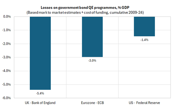
Losses on government bond QE programmes, % GDP
Source: Columbia Threadneedle, September 2025
For the UK in particular, these are very sizable losses. There is significant public interest in how these came to be.
Not all QE programmes were created equally
As the Bank had a peak balance sheet of around 40% GDP, only a little larger than the Fed at 35% GDP, some commentators wrongly assume the two country’s QE balance sheets had similar risk profiles.
In fact, the Fed had a much more diversified approach.
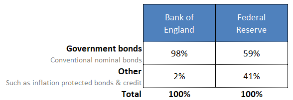
Composition of central banks balance sheets, at peak in December 2021
Source: Central bank websites, Columbia Threadneedle, September 2025
Only about half of the Fed’s balance sheet was invested in conventional government bonds. The rest was invested in areas like inflation-linked securities, corporate bonds, mortgage and agency backed securities. These other areas have generally proven to be much more resilient to the inflation and rate hikes of the past few years. Prices and returns for those allocations have generally faired reasonably.
By contrast, conventional government bonds have been hit hardest by the interest rate rises.
The Bank of England ran an approach that was much more concentrated in such government bonds. Nearly all - about 98% - was in gilts.
This concentration meant that at peak the BoE owned around 37% of all the gilts in issue – 1.9x the Fed’s peak ownership of 19% Treasuries.
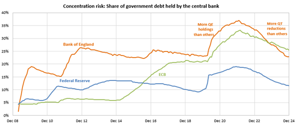
Concentration risk: Share of government debt held by the central bank
Source: Columbia Threadneedle, September 2025
Differences within the government bond allocation
Additionally, within the government bond allocation there are also important differences.
The Fed included inflation-linked government bonds in their remit. The BoE choose to exclude these types of securities completely, with consequences for taxpayer outcomes during the recent inflation hit.
More importantly, there were significant differences in the maturity profile of the bonds each central bank targeted.
The BoE made the decision to build their gilt portfolio in a quasi-passive fashion – buying all parts of the gilt curve equally. The UK famously has one of the longest maturity profile bond market in the world. So the decision to buy all parts of the curve equally left the Bank locked into the low rates on their bond holdings for much longer than other central banks. These long dated bonds have fallen by far the most. In some cases the capital losses exceed 75%.
The Federal Reserve did not conduct their market operations in a quasi-passive fashion. By contrast, the Fed was relatively nimble and timely, actively targeting the parts of the curve they felt warranted their focus. Sometimes they focused on the front end (e.g. during the Covid pandemic) at other times they focused on buying the long end (e.g. during the so-called ‘Operation Twist’ during 2012).
The result of these differences meant at the end of the QE era, the BoE QE programme had a maturity profile of 14 years, 1.8x longer than the Fed’s 7.8 years.
The duration mismatch in the BoE’s approach
The long maturity bonds that were acquired as part of the Bank’s passive operational approach are a big reason for the UK central bank seeing larger losses. Long maturity bonds have fallen sharply as a result of the interest rate environment.
As an example, during QE in May 2020 the BoE bought a series of 0.5% coupon 2061 gilts at a price of £101. Those securities have recently been trading at prices as low as £25 and under.
Arguably, these longer-dated maturities did not need to be bought at all. Household borrowings in the UK tend to be much shorter dated than elsewhere in the world. This difference stems in part from differences in mortgage structure.
In the US 30 year fixed rate mortgages are common. In the UK, short dated mortgages 2-5 year fixed rate are typical. So there would have been a much clearer transmission mechanism from buying the front end of the gilt curve, targeting that 2-5 year point, to boost the economy
Other QE programmes, including Sweden’s and Australia’s pointedly avoided buying long end bonds in part due to the additional financial risk and the weaker transmission mechanism. It is unclear why the BoE thought differently.
Conclusion: The cumulative effect of these design differences
The analysis in this note showed that the UK QE government bond losses stood at 5.4% of GDP versus 1.4% GDP for the Federal Reserve as of 31 Dec 2024.
This 3.7x worse outcome is explained in the following table:
| Greater ownership of the government bond market | 1.9x |
| A longer maturity profile giving rise to a great interest rate sensitivity | 1.8x |
| Other effects (including lack of inflation protection, larger peak balance sheet as percentage of GDP) | 1.1x |
While these results are tempered by the fact the analysis uses indices as proxies for the precise mark to market valuations of each central bank’s bond holdings, the results can be taken as “rough and ready” indications behind the worse financial outcome in the UK’s quantitative easing programme.
Bibliography
- Bank of England Monetary Policy Report, August 2025
- Bank of England Asset Purchase Facility Quarterly Report - 2025 Q2, August 2025
- Office of Budget Responsibility: Debt maturity, quantitative easing and interest rate sensitivity, March 2021
- House of Lords Economic Affairs Committee: Quantitative easing: a dangerous addiction?, July 2021
- Federal Reserve Bank of New York: System Open Market Account Portfolio
- Federal Reserve Bank of Kansas City: Considerations for the Longer-Run Maturity Composition of the Federal Reserve’s Treasury Portfolio, August 2024
- Financial Times: Where the Bank of England’s QE programme went wrong, Christopher Mahon, April 2025
- Columbia Threadneedle: The snap election could put QE losses back in focus, Christopher Mahon, June 2024
Appendix: Calculation detail
In essence, we model each central Bank’s QE programme as a “carry trade”, borrowing at central bank rates to invest in securities.
Returns for each bank’s holdings of government bonds are proxied by total return indices which approximate the characteristics of each of the central banks of holdings.
This allow us to create the returns for the balance sheet: we know the quantity and types of bonds bought in each month, how long they are held for, and the approximate total return. Against this is set the cost of finance at each central bank’s overnight rate.
The approximations are further detailed as follows:
| Central Bank | Proxy for the mark to market performance | Weighting |
|---|---|---|
| Bank of England | FTSE Actuaries UK Conventional Gilts All Stocks Total Return Index | N/A |
| ECB | Bloomberg EuroAgg Government Total Return Index | Adjustments made to reweight according to ECB’s capital key, which gives a higher allocation to certain ‘peripheral’ countries than the headline index |
| Federal Reserve | Bloomberg U.S. Treasury: 5-7 & 7-10 Year Total Return Indices | Adjustments made to reweight according to monthly weighted average maturity of the Federal Reserve’s Treasury Holdings |

Stay in touch


Explore

Undergraduate
Postgraduate
Policy
-
Follow us on Social media
-


